
Colours for molecular models
'Yes, but oxygen has to be red, doesn't it?' asks the person on the other end of the phone line. We're discussing a new model that they want but, in the size and material that they want, there are only a limited number of ball colours readily available. So, we're discussing how we colour the atoms in the model.
"Actually, no, it doesn't." I find myself saying in reply. Sure, conventionally, oxygen is denoted with red balls - allegedly because Hoffmann associated oxgen with burning and burning is red (although, if that were true, then oxygen would be yellow, as flames are most commonly yellow), but it wasn't always this way - way back before colour reproduction was feasible, atoms could only be printed in black and white on a page, so were represented with geometric images as below
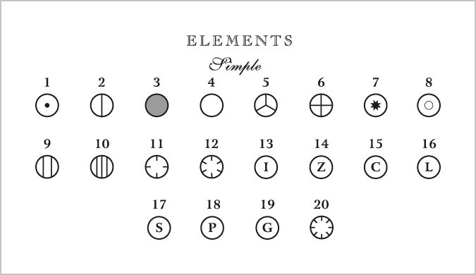
To the modern viewer that looks slightly weird, but it really is no stranger than using red to represent oxygen - it's merely a custom. Hoffmann's original colour designations (and claimed justifications) were:
Carbon: black (charcoal is black).
Oxygen: red (combustion in oxygen can be red).
Nitrogen: blue (the sky is blue, and nitrogen makes up most of the atmosphere).
Hydrogen: white (colorless gas).
Chlorine: green (greenish gas).
Sulfur: yellow (the element is yellow).
Phosphorus: orange (glows orange in a flame).
Iron: reddish brown (colour of rust).
The reasons claimed for these colours seem like post-event justification to me - neither the Wikipedia discussion or other online essays about the colour selections provide any references to back up the claim, while the Wikipedia discussion of CPK colouring refers to the reasons as 'mnemonics from several manufacturers' - again, withiout reference. Sure, in some cases the link is relatively obvious (C, Cl, S), but for the rest? Flames are not red, the most important element in the air is oxygen, white is not the same as colourless and red P is reddish brown. Personally, I suspect he just chose the colours from what he had available and other people have since attributed some grand design behind the selection. It happens a lot in history, probably because we're more comfortable with a clear narrative where things are chosen for logical reasons, and people make wise decisions based on the facts. Let's face it, though, most decisions we make in life are arbitrary and capricious and we try to justify them later. Seriously - how many times have your fellow researchers accidentally grown random crystals of a new compound and then written it up in a paper as though this was the target compound as part of some overarching research strategy?
Whatever the reasons for the colours, Hoffmann's choices passed into convention pretty much unchanged and, when Robert Corey and Linus Pauling (Caltech) developed wooden model sets in the 1950s, for building molecular models, they added some colours. When plastic molecular model kits were popularised in the early 1960s, Corey and Pauling's sets were added to by Walter Koltun (NIH). The color scheme that was used in these models became known as “CPK” colouring, after the initials of the three scientists. And yet, theirs was not the only colour scheme around - by the 1970s there were a large number of molecular model manufacturers around, some of whom chose to ignore conventions. And while at Miramodus we largely adhere to much of the CPK colouring for main group elements, we just ignore it for d and f block elements - in our opinion, it's much more important to be able to clearly distinguish between the first, second and third rows of the transition metals. Besides, given how often two transition metals are in the same crystal structure, we need to be flexible so that any two, three or more different metals can be distinguished in a model.
After all, that's what it's all about. There is a degree to which parts of a molecular model need to be readily recognised - specifically, the most commonly encountered elements - C, O, N, Cl, S, P. If you don't adhere to that convention, you're simply going to end up spending half your time explaining "yes, I know oxygen is normally shown in red, but in here it's turquoise because that it's my favourite colour, and I quite liked the idea of green for carbon". After all, there comes a point where "cool and unconventional" simply becomes weird and annoying. Beyond that, though, very few people would remember the CPK colour for Rhenium, so it hardly matters what colour you make a rhenium atom in a model, because literally everyone is going to have to be told 'you see the emerald / ruby / sapphire / amethyst / topaz coloured ball? Well, that's rhenium'.
Having said all that, the fact remains that atoms, being 1/4000 the size of the wavelength of light, have no intrinsic colour. Our colours are merely convenient conventions, so you are perfectly free to choose whatever colour you want for each element and devise whatever colour combinations you want. That allows you to choose colours that match, for example, your company colours, or colours that greatly distinguish between two elements that would, according to CPK colouring, have almost identical colours. If you are making a model of NaK alloy, for example, do you really want to have to make sure that you hold the model in the right light, so that you can distinguish between the Potassium atoms and the slightly lighter shade of the same colour used for Sodium? Isn't the point of a crystal structure to allow you to easily see the atom environments and the overall structure? and shouldn't your model do that, even if it means breaking some arbitrary and artificial convention set by someone whose authority in the matter is utterly random? Particularly when it certainly wasn't anyone we voted for.
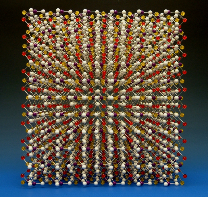
A crystal structure model of LiFePO4, made for a court case in the USA. The oxygens are represented in white, rather than the conventional red.
Would the model look as dramatic with red balls? probably not.
Does it matter that the lawyer would have to explain that the white balls represent oxygen and the red balls lithium? Again, probably not, because he'd need to explain conventional colouring anyway..
On top of all that, there is the factor of personal taste - if you want a blue iron atom, who said you can't have one and by what right? Of course, that can occasionally go awry when a customer has - and I'm trying to be tactful here - colour tastes that don't correlate with those of anyone else on the entire planet, ever. That happened to us just once in the worst way - the customer wanted a model of some binary compound, but they wanted such an awful combination of colours that we asked them, very tactfully, several times, if they were sure. We sent photos of the model and still they were delighted with what we made. But, from our perspective, far too many people who saw the model just responded with 'what the **** is that? That's ghastly'. Discretion requires that I don't identify the customer or the colour combination, but take a look at our colour options and choose the most god-awful combination you can think of - that's probably it. Let me put it this way - it was the only model that we've ever built where we deliberately omitted any labels that might identify us as the manufacturer. If you're not sure what you want, whoever you buy bespoke models from, please talk to them and at least acknowledge their advice - they probably have years of experience that allows them to suggest good colour combinations if you want, or need, to move away from CPK colouring.
Just as there was a change in convention in the representation of atoms when colour printing became available, we took advantage of changes in the available materials used for balls to expand the possibilities for building molecular models - hence, our use of transparent acrylic coloured balls to represent metal atoms. Making use of that expanded colour palette highlights the positions of metal atoms in molecules and crystal structures. We can also use larger balls to further accentuate the metal positions - that's particularly effective in organometallic compounds and coordination compounds, where the metal atom may be just a small component inamongst a large organic cage. But we can go further than that - because the balls are transparent, we can incorporate LED lighting into the ball itself to really emphasise its location. And even when we don't do something as dominant as that, simply using transparent colours allows a model to catch the light in a manner that looks really cool.
Having said all that, I would distinguish between model kits that are used for teaching, and models for displays, awards, etc. I wouldn't for a minute advocate manufacturers moving away from CPK colouring for the common main group elements when the models are to be used in schools - it's hard enough teaching chemistry without having to explain that 'yes, I know that nitrogen was blue in the other kit, but in this kit it's silver'. What I am saying is that the number of colours in the spectrum that can be readily distinguished is limited and, beyond the most common elements used for teaching - C, N, O, S, Cl, F, H - there is no justification for being highly prescriptive in denoting specific colours for other elements. That is particularly so when those colours have to be substitued so often because the colours ascribed to two elements in the same compound can be so similar - what is the point of having a convention if, in so many practical applications, it can't be usefully used? The purpose of a molecular model is to convey information about the structure that it represents and, in the case of our models and those of other similar model makers, to do so in as beautiful a manner as possible. As long as the atom types can be distinguished by colour, transparency or size, it doesn't actually matter what colours are used, providing that the person using the model knows what each colour represents and providing that that person is happy using their chosen colour scheme.

